Architecting Success
Brand architecture – the organizational system or structure underlying a portfolio – is something we don’t typically notice when it’s working well. The best examples go undetected: consumers naturally grasp a brand’s offering through carefully designed naming, color scheme, packaging, messaging hierarchy and organization of the physical or digital shelf. Like the bones of a house, we notice architecture only when it’s flawed – or worse, absent. Amid SKU proliferation, channel fragmentation & cluttered messaging, brand architecture can mean the difference between a product being selected or abandoned in a matter of seconds. This article unpacks brand architecture – when and why it works or doesn’t – with the goal of positioning it alongside other foundational tools in the brand management toolkit.

- Companies managing multiple brands in the same category need to create clear “swim lanes” to ensure brands in the portfolio work together – not in competition – to capture a greater share of the pie. Especially in big CPG firms, companies often jump on a trend and leverage scale to deploy it broadly. Consider a pet company with multiple brands of dog food. Seeing the migration of “grain-free” from human to pet eating patterns, they might add a grain-free SKU to each of their brands. Without a clear portfolio architecture, lines between brands become blurred. Perceived differentiation declines, and along with it, willingness to pay.
- Individual brands in growth mode find themselves in the (enviable) position of launching new products to reach incremental consumer segments, needs or occasions. Motivated by a desire to bring products to market quickly, these brands create new sublines, formats and/or varietals – but then encounter challenges when consumers are forced to discern differences between legacy and new products. Consider a juice manufacturer responding to consumers’ desire for less sugar and fewer calories. The creation of a new “Lite” subline to complement existing “Diet” products, while well-intentioned, may ultimately confuse shoppers who lack the time or patience to read nutrition panels.
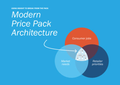
Enter architecture, the art & science of organizing a collection of products or brands to drive clarity, distinctiveness & incrementality. Successful businesses use architecture to penetrate new consumers and/or need states, help shoppers quickly intuit differences across a portfolio and even create guardrails for innovation.
While there are numerous ways to organize a portfolio, most ladder up to one or more of the following:
")
Brands organize portfolios based on price tier, often in the form of a good / better / best construct.
Example: Composite decking company Trex offers products in four tiers – Trex Enhance® (Good), Trex Select® (Better), Trex Transcend® (Best) and Trex Signature® (Luxury). Differences in warranty duration, available colors, heat resistance and durability justify price differences and help shoppers choose a product that matches their budget and definition of value.


Brands organize portfolios based on a highly discernible product attribute like flavor, ingredient type or format.
Example: Ferrara’s Nerds candy offers consumers four ways to enjoy: classic, rope, big chewy & gummy clusters. This architecture has myriad benefits, from courting consumers who typically buy other formats (e.g., gummy lovers) to justifying incremental shelf space and commanding a premium for novel experiences.


Brands organize portfolios based on the end users for whom the products are designed, often corresponding to specific markets or channels.
Example: CLIF bar offers products for kids (ZBAR), women (LUNA), protein-seekers (BUILDERS) and hardcore athletes (BLOKS). Through this structure, Mondelez can not only recruit new consumer segments to the franchise but also prioritize distribution in specific channels like sporting goods stores.

")
Brands organize portfolios based on what the product does for consumers.
Example: OLLY famously pioneered benefit-led communication in the vitamins & supplements category. While the brand targets wellness-oriented women 25-44, its portfolio organized by sleep, mood, beauty, gut health, women’s health and immunity allows Unilever to effectively show up for VMS shoppers prioritizing these benefits while informing distinctive memory structures (sleep = purple, gut health = green).

In the case of newer categories that require more consumer education, like, say, nootropics, it’s often appropriate to organize based on one of the first two dimensions (i.e., what the product is). In our experience, however, some of the best brands organize their portfolios based on an amalgamation of these dimensions – effectively combining what it is with who it’s for and what it does.
")
The world’s largest hospitality company with 39 brands, Marriott understands architecture well. Take its flagship and namesake brand, which spans the select service, premium & luxury tiers. Each brand has a unique set of services and amenities, offered at varying nightly rates (what) inspired by distinct traveler profiles (who) and how they view the role of a hotel in travel (why) – united by the master brand’s core visual identity and brand promise.
- Courtyard by Marriott is for value-conscious guests who want convenient, flexible, no-frills travel experiences
- Marriott is for conservative travelers who find safety & security in familiar hospitality experiences from a well-known, trusted brand
- JW Marriott is for premium guests who associate travel with wellbeing and seek elevated amenities & experiences that inspire
")
Everything about these sub-brands – from the 2D and 3D visual identities to the nightly rates, staff uniforms, check-in experience, onsite amenities and F&B programming – flows from this carefully orchestrated architecture.
")
Having been around for almost 150 years, Barilla has learned a thing or two about architecture. While most of its U.S. volume is classic blue box, in recent years the brand has proliferated to reach different consumers with nuanced needs at varying price points.
- Gluten-Free, Whole-Grain and Protein+ are for pasta lovers with dietary and/or macronutrient goals
- Al Bronzo is for home chefs who want a premium taste experience without the fuss of homemade pasta
- Chickpea & Red Lentil is for carb avoiders who prioritize nutrient density but don’t want to sacrifice their pasta ritual
- Ready Pasta is for consumers short on space, time & cooking utensils who still want a home-cooked meal

Notably, Barilla uses product naming, color, packaging shape and messaging hierarchy to quickly and effectively resonate with each of these consumers and use cases.
The good news is, it’s never too late to create (or optimize) the system or structure underlying your brand. You don’t need a degree in architecture – just a strong brand identity, a deep understanding of how consumers engage with your category and a network of partners to bring it to life.
Interested in learning more? Contact us at info@seuratgroup.com.